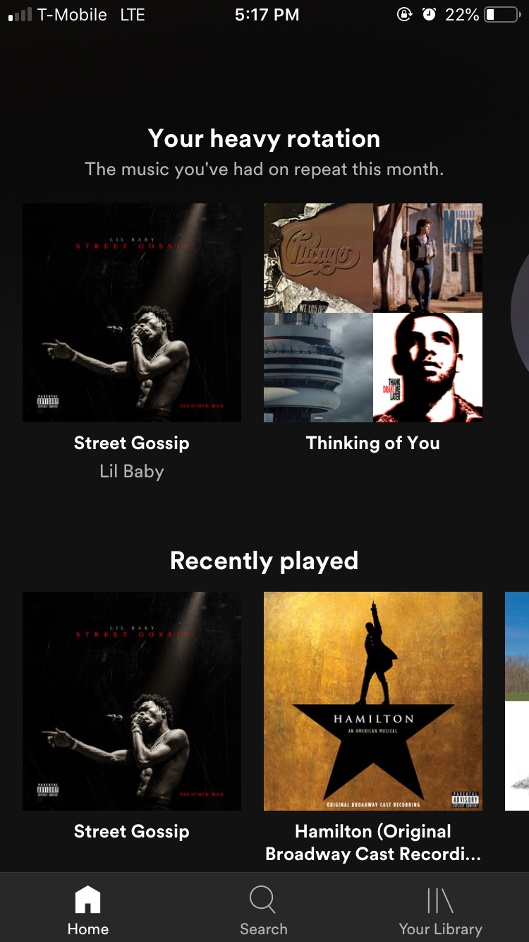
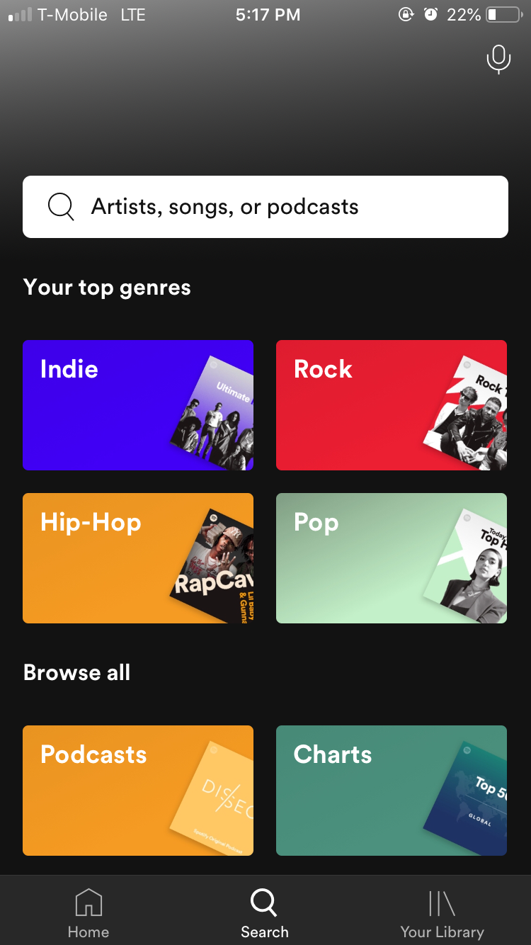
I don’t have many apps on my phone, but this is one that I use a lot and has also been redesigned recently. They simplified the navigation bar down to three tabs, which are labeled because it’s a little hard to tell what library is without the label. Under each tab there are options to explore further and further refine information. It looks like the same font is used just with different weights throughout the app. The dark background is very modern and text remains legible because of its color and size.